It’s time to paint the walls again and you’re tired of the current color (been there). Now you’ve got a problem. How do you choose the right paint color for your home and your walls? It doesn’t seem easy. However, there are solutions out there for you. That’s what we’re discussing today.
Let’s be honest. Choosing the right paint color for your walls is very much a personal aesthetic thing. What’s right for you won’t necessarily be right for someone else. So, I can’t just say: “Grab this paint color. Here’s the hex code. See how close you can get.” That solution won’t work. But I can give you some tips to find the right color palette for you and you can narrow it down from there.


Option 1: Drawing Inspiration from the Room
You can pull wall color inspiration from all sorts of places. You can use your current (or future) furniture and wall art for color inspiration. I’ve seen inspirational interior design periodicals (in print and online) which offer inspiration. The point is you’ll find inspiration for the right paint color for your walls all around you.

Transporting Your Inspiration
If you choose to use this method of choosing the right paint color for your room, then the next question is how to take that inspiration with you to the paint store.

Traditional Method
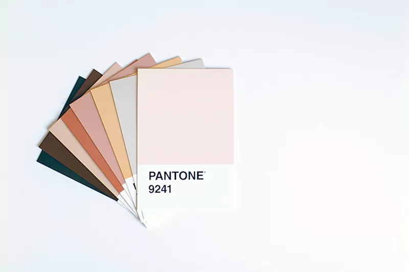
Since you’re in the market for new wall paint, then you’re probably planning on taking some cell phone photos of your room and the art/furniture which inspires your paint color choice. If not, then you’ll try and guess the color(s) you want to match. Then you’ll peruse the paint chips out on display to see if there’s one or more which matches your color selections. You’ll take the chips home and hold them up against the wall to try and make a decision. This method is typical and works well enough for most people.


Alternate Method
If you’ve decided to use some art to help you choose the right paint color, then you might prefer drawing out the colors from the art directly rather than guessing if you’re close. I found a solution which helps draw out a color swatch from a picture. It’s an app called Palette which I use to create swatches with my photos. The app has several different arrangements for displaying the color selections and lets you choose several different color options (even choosing custom color areas). Choose the combo you like best.


I think that carrying your phone with one of these into a hardware store will make your life much easier when it comes to choosing the right paint color. You can even take pictures of your furniture and make a similar color swatch if you’re drawing your paint color inspiration from your furniture.
Option 2: Creating a Mood from Scratch
Your next option is creating a room from scratch. The choosing the right paint color is a very important base upon which the rest of the room’s mood stands. Usually, you don’t YET have the art or furniture which you could draw inspiration from.

General Mood and Palette
The first question to ask is what kind of general look do you want. Do you want something light, bright, dark, muted, warm, cool, neutral, energetic, tranquil, contrasting, formal, informal, etc. Your final choice depends greatly on what feel you want in the room.

With this information, you can then proceed to choose the right paint color based upon your mood choice. You can research paint color choices on the internet if you’re unsure about what colors will create what moods. There are plenty of websites out there ready to share that information with you.
Example Color Palettes
Color palettes such as these will convey the general moods listed.


Option 3: The Old Standby
You always have the option of going with good old white paint for your walls. It’s a staple for a reason. White walls and ceiling brighten the room significantly and go with almost everything. You really can’t go wrong with choosing white for your new paint color.

If you are replacing a darker color with white paint, you should really get a primer to cover the darker color. Otherwise, the darker color underneath will overpower the white layer on top.


Conclusion
Choosing the right paint color becomes much easier to do when you know what you want to accomplish in the room being repainted. If you have something to draw inspiration from, use it. If you want to create a mood from scratch, then paint color is where you start. With proper thought and preparation, you should be able to choose the right paint color for your walls.


Best Sellers

Cramer Imaging Newsletter

Receive monthly updates in your inbox from us.

