Everyone may think of themselves as a competent art critic but few actually are. Art critics are well studied in the various fields of art which they critique. They are often artists themselves. Being an artist allows critics certain insights into how a piece of art was created and how it could be improved. Then, they can more accurately critique a photo or other form of art.
 If you would like to learn more about how to properly critique art like an art critic, then that’s a little of what we’re talking about today. Since I’m a photographer, I’ll share how to properly critique a photo with you.
Remember art is a highly subjective field which is open to broad interpretation. Photography is just one subset of that field. Not all art is created for the purpose of being pretty. With that in mind, here are some major points to properly critique a photo.
Also, fair warning, this is a very long and detailed post. Be prepared. I give you a lot of information before the end.
Was There Artistic Intent?
While this might not be the first thing which springs to your mind when you go to critique a photo, it should be. This single question is the entire basis upon whether or not you judge it on the merits of being a snapshot or on the merits of being a piece of art.

It may not be obvious at first whether or not the photographer intended the photo to be art. You may have to do some staring at it for a while to figure that out for yourself. Remember: don’t worry about whether or not the artistic intent was successful just yet. All you need to do is determine whether or not it was present when the photograph was created.

If you deem that the photographer intended the photo to be artistic, then you should strongly consider the next several points when critiquing the photo in front of you as you are now critiquing it as a piece of art.

What is the Color Like?
This point is probably the first thing that you noticed about the photo: its color. In fact, the photo’s color could even be the reason you found yourself drawn to take a further look at it to begin with. You should easily be able to tell if this photo is in color or in a monochromatic color scheme such as black and white.

Color Depth
Now, to properly critique a photo, it’s time to look a little deeper than that at the color in the image before you. Take a look at the color saturation. Does it feel natural to the subject? Similarly, do skin tones feel properly colored or do they seem off? Could the photographer have intended skin tones to be off? If so, it should be readily apparent. If not, then there’s something to think about.

Highlights and Shadows
Take a look at the brightest and darkest parts of the photo. Do you see details there or does it feel like a solid mass of black, white, or other similar color? A good photographer knows how to control the highlights and shadows, the areas you were just looking at, and keep details from being lost there.

HDR Issues
Another point to consider is whether or not the photographer has used HDR (high dynamic range) on the photo. HDR is a tool like many other tools. Others abused in the past. It’s designed to bring back details in places too bright or too dark for the camera to capture so that the photo may appear that much closer to what your eye can see.

If you look at a photo and feel that the colors there are a bit too monotone and flat, there’s a good chance it’s been poorly HDRed. If you have trouble finding areas of highlight or shadow, if the colors feel a bit radioactive to you, then the photographer “juiced up” the photo too much. This craze calmed down in years past so you aren’t quite as likely to run into it now but there’s still the chance.

What Kind of Composition Does the Photo Have?
Good composition is one of the basic elements of all good art, photography included. In order to critique a photo, take a good hard look at the composition of the photo. There are several different compositions it could follow. For instance, does it follow the rule of thirds? How about the golden mean? Perhaps it displays a much more simplistic composition. Could there be some combination of the above?


Whatever the photographer’s choice of composition, make sure you evaluate whether or not the photo in front of you was successful at achieving good composition.
How Does the Photo’s Overall Lighting Look?
This point somewhat ties into the color part previously discussed. All photos, artistic or otherwise, are lit in some fashion. You decide for yourself if the lighting was properly executed or if it wasn’t.

Is the photo properly exposed? Do you find yourself thinking there’s too much light or not enough light? Over exposure and under exposure can be issues which the photographer overlooked or may have deliberately chosen as an artistic element of the photo.

As yourself some of the following questions. What direction(s) is the light coming from? Does it leave a great deal of shadow in the photo? Are those shadows desirable (such as a big part of the photo’s composition)? Is the light soft and diffuse or is it direct and harsh? Is the light overall warm or cold? Do you wish that the light was coming from a different direction?

Similarly, is the subject properly lit? Does the background overwhelm the subject with its lighting? Does the available light flatter the subject matter or does it leave it in a terrible light? Pardon the pun. Depending upon the intent of the photo, the latter might be a more desirable choice. Do take that into consideration when critiquing the lighting of the photo.

What is the Subject Matter?
Here’s another point which you’ve probably noticed in the first couple seconds of viewing the photo. The subject matter depicted is the reason why the photo exists, that and the photographer needed to create something. Without a subject, there is no photograph of any kind.

So, when critiquing the subject matter of a photo, here’s some points to consider. Is there a clear subject in the photo? Can you tell what it is within a few seconds of looking at the photo or do you have to stare at it for a while to figure it out?

What kind of subject is it? Is it human, animal, plant, abstract, etc.? Is there texture in the photo (wood grain, fluffy, smooth, shiny, etc.)? Are there multiple subjects in the photo? Do the subject(s) look natural or naturally positioned in the photo? If not, why not? On the other hand, might the photographer intend to show you the subject(s) unnaturally positioned? Is the subject matter family-friendly? If not, why not?

To critique a photo, you must glean a lot of information about what the photograph is and why it exists from the subject matter depicted. Pay close attention to what the photographer is telling you.
Is the Photo Sharp and Clear?
Here’s a point which you’ll probably think about at some point in your critique. Is the photo sharp? Is the subject matter in focus? If it’s not, why? On the other hand, could artistic blur be a creative choice on the part of the photographer?

If the photo is depicting people or animals, you must check and see if the subject’s/subjects’ eyes are in sharp focus. If the eyes are not in complete focus, that is a serious fail on the part of the photographer.

Do you find that the background is in focus but the foreground is not? Did they over-sharpen their photo so now the edges look strange and there’s pixelization visible? These are also serious failures of the photographer.

Is there motion blur in the photo? Is the photo trying to depict motion as part of the subject? If not, that’s another fail.

Are There Obvious Signs of Post-Processing Visible?
I’ve seen it posted several places: “Good design is obvious. Great design is invisible.” The same holds true with post-processing. Any photographer who seeks serious artistic recognition for his or her photography processes up his or her photos. The “no filter” movement isn’t present in serious photography circles.

The question becomes whether or not you can see signs of the photographer’s post-processing work. Did they try to remove something and fail to get all of it? Is a tiny portion (or several portions) of the photo’s coloring off for the area it’s part of? Does the lighting or shadow of a part look off compared to the rest of the surrounding area?

Is there an obvious darkening or lightening of the photo’s edges? This is called vignetting and is often a deliberate choice to help you focus on the subject matter. Is only part of the photo in color and part in a monochromatic color scheme? This is also a deliberate artistic choice.

Here’s a final question you have to ask yourself. Could obvious post-processing be an artistic choice of the photographer’s? For some of these errors, that would be highly unusual but not unheard-of. For others, you see them everyday in photography.
How is the Photo Presented?
This is another one of those points which should have been very obvious from the first few seconds of seeing the photo. How is this photo, which you are critiquing, presented?
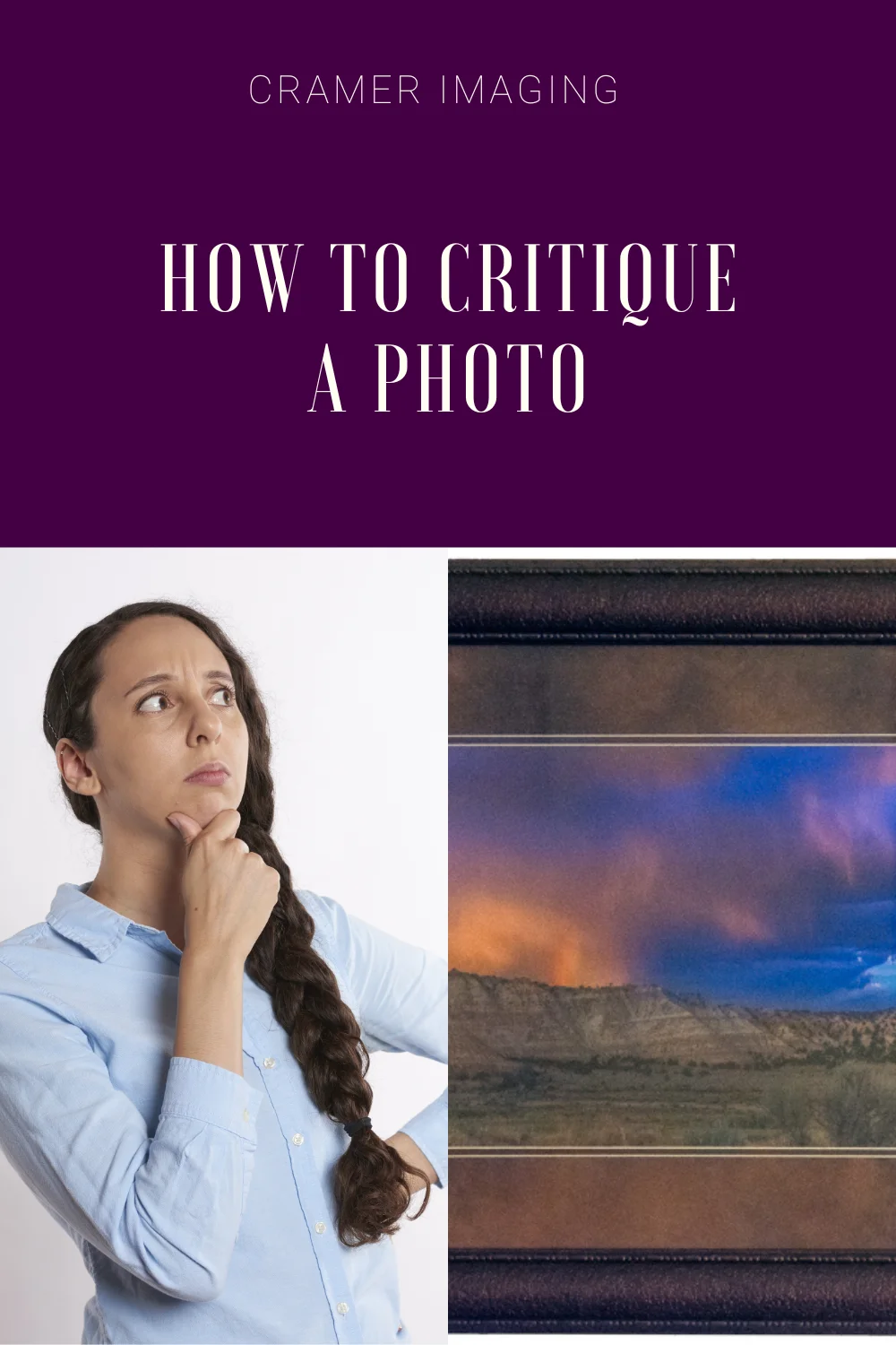
The Print Itself
For instance, do you find it displayed online or is it a print someplace? Is it hanging on the wall or displayed on some other flat surface? Do you find the photo printed in a book or calendar? What kind of paper is the photo printed on? Is it glossy, mat, metallic, textured, etc.? Is it printed on on canvas, metal, acrylic, or wood?

The Framing
Next, does the photo have a frame? How big is the frame? What kind of frame is it? Does the frame do the photo justice? Is it matted? What color(s) is the mat? Is it double matted? How is the picture hole cut? Is it rectangular, circular, or some other shape? Does this mat do the photo justice? Does the mat, frame, and photo work well as a combination or do you feel that something is off there?
Other Viewing Conditions
 Furthermore, is this photo properly lit for your viewing? Do you need more light to see it properly or do you need to turn off some lights to darken things down? Do you have a distraction-free background of a wall to view the photo with? Also, do you find the photo displayed where you can comfortably view it at eye level or do you have to stoop/crane your neck to see the image?
Photos displayed online are almost always backlit by the screen but there are other considerations to think about here. Do you have a distraction-free webpage background to view the photo with? Is the photo available in a high enough resolution that you can see all the details without it pixelating?
Is there a watermark present in online or print form? Does this watermark interfere with proper evaluation of the photo you are critiquing?

Presentation for critiquing is the icing on the cake. It should enhance your ability to properly view and critique the photo without being distracting. However, if something is distracting you, you will not be able to properly critique the photo for what it is.
What Would You Change to Make the Photo Better?
Here’s one of the most important parts of critiquing a photo: what would you do to make the photo better? You’ve been staring at this photo for a while. You’ve come to see many of the good points and the bad points it has to offer. There’s a strong chance you’ve noticed what’s wrong with it in your opinion. Now, what would you do with the photo to make it right? This is what separates the critiques from the haters.

Would you crop it a bit different to emphasize or de-emphasize something or to improve the composition? Would you turn the photo into a monochrome color scheme (black and white or similar) or would you turn it back to full color? How about pulling out a flash unit to get some different lighting in the photo? Would you change subject matter positioning? Would you change where the camera focused to get better sharpness and clarity someplace? Might you alter how the photo was processed somehow? Would you print the photo on different paper or use a different mat/frame to display it in?

These are all examples of how you would change something about the photo to make it better. Use your list of “I wish the photographer had done ____ with this photo” that you’ve been generating through the last several points of critique. What would you do with the photo in front of you to make it better?
Does the Photo Evoke Something in You?
The final point to properly critiquing a photo is to evaluate whether or not the photo in front of you evoked something in you. This can be the easiest or most difficult part of the whole critique. Overall, when you critique a photo, you evaluate whether or not the photographer succeeded in creating something artistic based on whether or not it art worked for you. This is highly subjective and what works for you won’t work for the person standing next to you.

To start with, did the photo create some emotion in you when you first saw it? Does it create some emotion now? Do you feel inspired to create something yourself? Do you want to go visit the place depicted? How about if you miss the person depicted? Do you suddenly want to go help someone in need? Do you feel anger and outrage at some injustice? Are you afraid of something in the picture? Do you feel disgust and revulsion at what you see? These are all examples of evoking emotion which you might feel at seeing the photo you are critiquing.

If you’ve been answering all the questions above in the semi-objective categories above, then you should have a pretty good idea of whether or not the photograph caused some kind of stir in you. Above all, this is probably the most important part of how to critique a photo.
Conclusion
In conclusion, critiquing a photo as art is simply about determining if there was artistic intent to begin with and then determining whether or not that photo was successful at accomplishing it. All the points you check from color and composition to presentation and emotional appeal are about determining whether or not the artistic intent succeeded. This is how art critics go about critiquing a photo or other piece of art.
Now that you’ve learned how to properly critique a photo, we’d love to see some examples of photos you’ve found or taken yourself and critiqued. Leave those down in the comments section below. Furthermore, please remember: don’t violate someone else’s copyright while doing this. Leave a hyperlink to the image if necessary.
Best Sellers

Cramer Imaging Newsletter

Receive monthly updates in your inbox from us.

